Back in 2007 when I bought Capricorn Mohair socks it was very ‘Green’.
Our packaging was very green, we looked like The National Trust, and interestingly enough The National Trust became one of our wholesale customers.
Our sock colours in those early days – Brown, Green, Navy, Cream, Red and Black
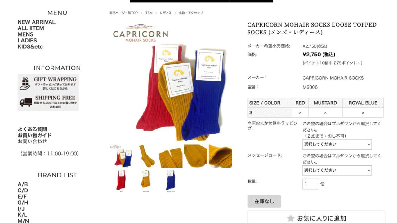
So, our ‘brighter’ colours, Cream and Red, were very limiting, so how and why do we now have so many bright colours and even our packaging is the opposite end of the spectrum from those early days, the answer is JAPAN.
It is an interesting story as the ‘unique’ colours we pioneered, have then cascaded into the UK sock market.
Let me explain a little more!
For the last 10 years how did the process work?
These guys were very different than me.
I am a country boy, a former Shepherd and frankly, I like Green.
When I met with people in the fashion markets in Japan they were just slightly different than me.
I would meet them most years in London and they used to push me, very interesting to do business with.
Every year they gave me a palette of colours then I had to get some lab dyes done and then once we agreed on colours we would have to do a dye batch, to prove we could commercially produce the correct colour in quantity.
We would have to dye 240 + pairs to meet the minimum dye requirements.
For the first few years, I resisted and fought this process.
They then requested new packaging from us for the Japanese market, and we did as we were told!
After doing this for a number of years it struck me – Stop resisting and embrace it as we are now leading the way in the UK, especially when I saw other UK producers starting to copy our colours.
I knew these were ‘our colours’ as we had brought them from this stage to this – show colour swaths.
So, I stopped and thought long and hard about this.
For one year we did not go to trade fairs etc as we rebranded the business – new logo, and now not green we became white with lots of our new colours cascading over from our Japanese sock production.
It gave us a great opportunity to try these new colours and as I spent a lot of my time on shows and people watching for many hours I started to see some of the colours coming through.
An example of this is – Mustard – Surely a farmer wearing corduroy trousers would be the only person to buy that colour. How wrong was I.
12 – 18 months after us first producing this colour I started to see the colour appearing on people more fashionable than me – weekdays at Country Living Fair was my time to spot the colours coming through.
Then as our colours were being produced by UK sock knitters and dyers other people started using ‘our colours’. Copying is the greatest form of flattery, but we were and still are always a year or two ahead of them. We were always working on colours for the following year – Oct/ Nov samples for the following Aut/ Winter collections and we found that the ‘normal fashion’ on the high street was a year beyond that!
I mentioned we stopped going to trade shows as we rebranded, now there is a story.
The first year back I was overwhelmed, it now was not the National Trust, garden centres etc buying our socks we now were on the high street!
So after going down that path for the past 10 years, that is why we look as we do.
I know so many of you have supported us over this journey and I cannot thank you enough. If you have any thoughts or ‘favourite colours’ over the past 10 years please do leave a comment below and what colours are working on for Autumn/ winter 2023, you will just have to wait and see!
Further reading
- Dalkeith (Socks produced for the Japanese market
- Sussex socks (Socks created for the Japanese market)
